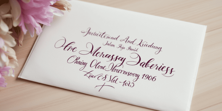
In the age of digital communication, there’s something undeniably charming about receiving a beautifully addressed envelope in the mail. Calligraphy, the art of decorative handwriting, has long been used to add a personal touch to correspondence. However, a question often arises: can calligraphy actually be a cause for returned mail? Let’s dive into this intriguing topic and explore the intersection of art and postal regulations.
Understanding Postal Regulations
Before we delve into the specifics of calligraphy, it’s crucial to understand the basic guidelines for addressing mail. The United States Postal Service (USPS) and other postal services worldwide have strict regulations to ensure efficient mail delivery. These guidelines primarily focus on legibility and the correct placement of address elements.
Key points in postal regulations include:
- Clear and legible writing
- Proper formatting of address lines
- Correct placement of return address and recipient address
- Use of appropriate ink colors (preferably dark ink on light envelopes)
The overarching principle is simple: postal workers and sorting machines must be able to read the address quickly and accurately.
Potential Issues with Calligraphic Addressing

While calligraphy can be stunningly beautiful, it can potentially cause issues in mail delivery if not executed thoughtfully. Here are some concerns:
- Readability: Some calligraphy styles, particularly those with extensive flourishes or highly stylized letters, can be challenging to read at a glance.
- Automated Sorting Challenges: Modern postal systems rely heavily on automated sorting machines. These machines are designed to read standardized typefaces and may struggle with ornate calligraphy.
- Interpretation Errors: Unusual letter forms in certain calligraphy styles might be misinterpreted by both machines and humans, leading to delivery errors.
Common Calligraphy Mistakes That May Lead to Returned Mail
To avoid the disappointment of returned mail, be aware of these common pitfalls:
- Overly Ornate Lettering: While it may look impressive, extremely decorative calligraphy can be hard to decipher quickly.
- Poor Contrast: Using light-colored inks or metallic inks on light envelopes can make addresses difficult to read.
- Improper Spacing or Alignment: Inconsistent letter spacing or misaligned address lines can confuse readers and sorting machines alike.
- Incorrect Letter Forms: Some calligraphic styles alter letter shapes significantly, which might lead to misinterpretation.
Best Practices for Using Calligraphy on Mail

Don’t let these potential issues discourage you from using calligraphy on your mail! Here are some best practices to ensure your beautiful envelopes reach their destination:
- Choose Appropriate Styles: Opt for more legible calligraphy styles like Italic or Copperplate for addressing envelopes.
- Maintain Clarity: Ensure that each letter and number is clearly formed and distinguishable.
- Use High Contrast: Stick to dark inks on light envelopes for maximum readability.
- Practice Consistency: Keep your letter sizes, spacing, and alignment consistent throughout the address.
- Double-Check Accuracy: Carefully proofread the address to avoid any errors in spelling or numbering.
Expert Opinions
Professional calligrapher Emily Watson shares,
“While I love creating elaborate designs, for addressing envelopes, I always prioritize legibility. I recommend a semi-formal Italic script for a beautiful yet clear address.”
John Smith, a veteran postal worker, adds,
“We appreciate the effort put into calligraphy, but our primary goal is efficient delivery. Clear, readable addresses make our job easier and ensure the mail reaches its intended recipient.”
Alternative Options
If you’re concerned about potential delivery issues but still want to incorporate calligraphy, consider these alternatives:
- Combine Calligraphy with Printed Labels: Use calligraphy for the recipient’s name and a printed label for the address details.
- Decorative Elements: Apply calligraphy to decorative elements on the envelope while keeping the address in standard print.
FAQs
Q: Will my calligraphy-addressed mail definitely be returned?
A: Not necessarily. If your calligraphy is legible and follows addressing guidelines, it should be delivered successfully.
Q: Are there specific calligraphy styles that are more “mail-friendly”?
A: Yes, styles like Italic, Copperplate, or Spencerian tend to be more legible for mail purposes.
Q: Can I use colored inks for addressing?
A: While it’s best to stick to dark inks, any color that contrasts well with the envelope should be acceptable.
Conclusion
Calligraphy can indeed be a cause for returned mail if it compromises the legibility of the address. However, by following best practices and prioritizing clarity, you can create beautifully addressed envelopes that are both artful and deliverable. Remember, the key is to strike a balance between aesthetic appeal and practical readability.
So, go ahead and let your creativity flow – just be sure your mailman can read it too!
Have you had experiences with calligraphy-addressed mail? Share your stories or ask questions in the comments below!


